Choosing the Right Image Format: JPEG, PNG, SVG, or WebP
You finish designing a graphic and export it in several different formats. One version looks sharp but has a surprisingly large file size. Another loads quickly but loses fine details when you zoom in. A third keeps its transparent background perfectly, while another refuses to display transparency at all. Although every file shows the same picture, each behaves differently because the format determines how image information is stored.
Choosing an image format is more than selecting a file extension. It affects image quality, storage requirements, website performance, editing flexibility, and even how well the image appears across different devices. Understanding these differences helps avoid common mistakes such as uploading oversized graphics, saving logos in unsuitable formats, or repeatedly compressing photographs until noticeable quality is lost.
Rather than asking which format is universally “best,” a better question is what each format was designed to accomplish. Once that purpose becomes clear, selecting the appropriate format becomes much easier.
Every Digital Image Begins With Stored Information
Although images appear simple on a screen, computers only understand data.
Each image file contains instructions describing color, brightness, position, and other visual details. The format determines how those instructions are organized and how efficiently they are stored.
Some formats focus on preserving every detail exactly as it was created. Others reduce file size by removing information that people are less likely to notice. Certain formats describe mathematical shapes instead of individual pixels, allowing images to remain perfectly sharp regardless of size.
These different approaches explain why two files showing nearly identical pictures can vary dramatically in storage size and editing behavior.
A diagram comparing raster images and vector images would help readers understand these two fundamentally different methods of storing graphics.
Raster and Vector Images Solve Different Problems
Before comparing individual formats, it helps to understand the distinction between raster and vector graphics.
Raster images consist of tiny colored squares called pixels. Every photograph captured by a smartphone or digital camera is stored this way. The higher the number of pixels, the greater the potential detail, but enlarging the image beyond its original resolution eventually reveals visible pixelation.
JPEG, PNG, and WebP all belong to this raster category.
Vector images work differently. Instead of recording individual pixels, they describe lines, curves, shapes, and colors using mathematical instructions.
Because the computer redraws these shapes whenever the image is displayed, vector graphics remain sharp whether they appear on a small mobile screen or a large billboard.
SVG is the most widely used vector format on the web today.
Understanding this distinction immediately explains why photographs almost never use SVG while logos and icons often do.
Compression Determines File Size and Image Quality
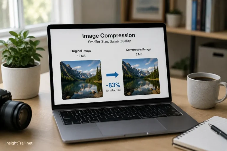
One of the most significant differences between image formats lies in how they reduce file size.
Without compression, digital images would occupy far more storage space and take much longer to transfer across the internet.
There are two primary approaches.
Lossless compression preserves every piece of original image information while organizing it more efficiently. When the image is opened again, nothing has been discarded.
Lossy compression takes a different approach. It permanently removes certain visual information to reduce file size more aggressively. If done carefully, much of this removed information is difficult for the human eye to notice, especially in photographs.
The choice between these methods influences editing flexibility, storage efficiency, and visual quality far more than many people realize.
JPEG Was Built for Photographs
JPEG became popular because it solved a practical problem.
Photographs contain millions of colors and subtle transitions between light and shadow. Storing every detail without compression would produce huge files that were difficult to share, especially during the early years of the internet.
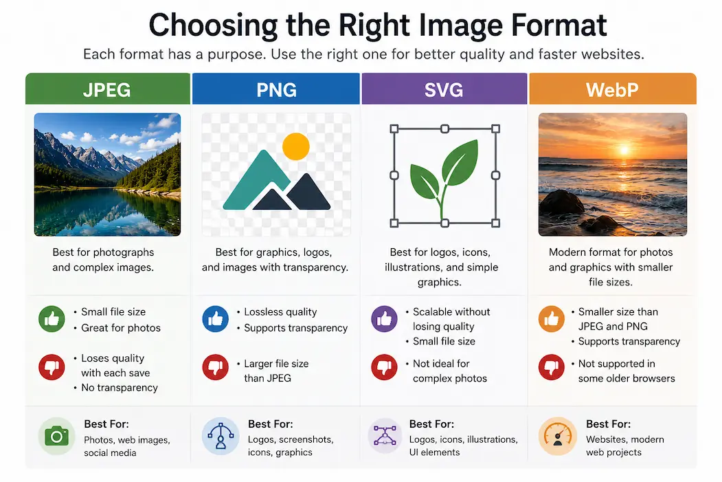
JPEG uses lossy compression to reduce file size significantly while preserving an image that still appears natural to most viewers.
For family photos, travel pictures, product photography, and everyday camera images, this balance between quality and efficiency often works very well.
However, JPEG has limitations.
Each time an image is saved using lossy compression, a small amount of information may be discarded. Repeated editing and resaving can gradually reduce image quality, introducing visible artifacts around text, sharp edges, or detailed patterns.
For this reason, many designers keep an original master file and create JPEG versions only when exporting the finished image.
PNG Prioritizes Accuracy Instead of Maximum Compression
PNG approaches image storage differently.
Rather than aggressively reducing file size, PNG focuses on preserving image quality exactly.
Its lossless compression means every pixel remains intact when the image is reopened.
This makes PNG particularly useful for screenshots, interface elements, diagrams, illustrations, and graphics containing sharp text or fine lines where even small compression artifacts would become noticeable.
PNG also supports transparent backgrounds.
Instead of surrounding a logo with a solid white rectangle, PNG can preserve transparent areas, allowing the image to blend naturally with different webpage backgrounds.
The trade-off is that file sizes are larger than JPEG when storing photographs.
Using PNG for every image on a website may therefore increase loading times without providing noticeable quality improvements for ordinary photos.
SVG Stores Instructions Instead of Pixels
SVG behaves very differently from the other formats discussed so far.
Rather than storing millions of colored pixels, an SVG file contains mathematical descriptions of shapes, lines, and curves.
When the image appears on a screen, the browser calculates those instructions and redraws the graphic at the appropriate size.
Because no fixed pixel grid exists, the image remains perfectly sharp regardless of whether it appears as a small navigation icon or a large presentation graphic.
This characteristic makes SVG particularly valuable for logos, icons, simple illustrations, charts, and interface graphics.
However, SVG is generally unsuitable for complex photographs because describing every tiny detail mathematically would become impractical.
The format excels where clean geometric shapes dominate rather than natural photographic textures.
WebP Was Designed With Modern Websites in Mind
As websites became more visually rich, developers needed image formats that balanced quality with faster loading speeds.
WebP was created to address that challenge.
It supports both lossy and lossless compression while often producing smaller files than equivalent JPEG or PNG images.
This reduction in file size helps webpages load more quickly, particularly for visitors using slower internet connections or mobile devices.
WebP can also support transparency and animation, giving it flexibility that allows it to replace several traditional image formats in many situations.
Even so, compatibility should always be considered. Although support is now widespread across modern browsers and operating systems, certain older software or legacy workflows may still rely primarily on JPEG or PNG.
Choosing WebP therefore depends on both compression efficiency and the environments in which the images will be used.
| Format | Image Type | Compression | Transparency | Best Suited For |
|---|---|---|---|---|
| JPEG | Raster | Lossy | No | Photographs and realistic images |
| PNG | Raster | Lossless | Yes | Screenshots, graphics, logos with transparency |
| SVG | Vector | Mathematical instructions | Yes | Logos, icons, illustrations, diagrams |
| WebP | Raster | Lossy or Lossless | Yes | Modern websites and web graphics |
Selecting the Format Starts With the Purpose of the Image
People sometimes search for a single image format that works perfectly in every situation.
In practice, each format exists because different types of images have different requirements.
A vacation photograph, a company logo, an application screenshot, and a navigation icon all contain different kinds of visual information. Expecting one format to handle each of them equally well often leads to unnecessary compromises in either image quality or file size.
Instead of starting with the file extension, it is usually more effective to ask how the image will be used, whether it needs transparency, how often it will be edited, and where it will ultimately be displayed.
Those questions naturally guide the format selection far more reliably than memorizing a simple list of recommendations.
Consider Where the Image Will Be Viewed
An image that looks perfect on your computer may not always be the best choice once it is published online. Websites, mobile apps, presentations, printed documents, and social media platforms each handle image files differently.
For websites, loading speed often matters just as much as visual quality. A page containing several oversized images can take noticeably longer to load, especially on slower internet connections. Visitors may leave before the page finishes displaying, and search engines also consider page performance when evaluating websites.
Printed materials introduce different priorities. Images intended for brochures, posters, or reports often require higher resolutions than those used on websites because they must remain sharp when reproduced on paper.
Understanding the final destination of an image helps determine whether the smallest possible file, the highest possible quality, or a balance between the two is the better choice.
Editing Habits Can Influence the Best Format
The way people will edit an image is another important consideration that many overlook.
Suppose you create marketing graphics that you revise several times before publication. Saving every intermediate version as a JPEG can gradually reduce quality because the image is recompressed each time it is exported.
A better approach is to keep the original project or use a lossless format while editing. Once the design is complete, create a JPEG or WebP version for distribution if smaller file sizes are beneficial.
This workflow preserves maximum quality throughout the editing process while still producing efficient files for sharing or publishing.
It also reduces the risk of visible compression artifacts appearing after multiple rounds of revisions.
Transparency Changes the Decision
Transparent backgrounds are common in modern digital design.
Company logos often need to appear on white, dark, or colored backgrounds without carrying an unwanted rectangular border. Interface icons and overlays also depend on transparent areas to blend naturally into websites and applications.
JPEG does not support transparency. Any transparent areas must be replaced with a solid background color before the image is saved.
PNG and WebP both support transparency for raster images, making them suitable for graphics that need flexible backgrounds.
SVG supports transparency as well, but because it is a vector format, it works best for graphics built from shapes rather than detailed photographs.
Recognizing whether transparency is required often eliminates several unsuitable format choices immediately.
Smaller Files Improve More Than Storage Space
Reducing file size is not only about saving disk space.
Every image downloaded from a website consumes bandwidth and requires time to transfer across the network. Larger files increase loading times, particularly for visitors using mobile networks or slower broadband connections.
Smaller images also reduce data usage, which remains important for users with limited mobile data plans.
From a website owner’s perspective, efficient images can improve page responsiveness, reduce hosting bandwidth, and contribute to a smoother browsing experience across desktops, tablets, and smartphones.
This does not mean quality should always be sacrificed. The objective is to achieve an appropriate balance where the image appears clear without storing unnecessary data that users are unlikely to notice.
Browser Support Has Become Much More Consistent
A decade ago, choosing an image format often required careful attention to browser compatibility.
Today, modern browsers on Windows, macOS, Linux, Android, and iPhone support the most common web image formats, including JPEG, PNG, SVG, and WebP.
That broader compatibility has given designers greater flexibility, particularly when optimizing websites for speed.
However, compatibility is not limited to browsers. Some older desktop software, printers, content management systems, or editing tools may still work more comfortably with traditional formats.
For organizations supporting older hardware or specialized software, verifying compatibility before converting large image collections can prevent unnecessary workflow interruptions.
Common Assumptions About Image Formats
Image formats often come with simple rules that sound helpful but are not always accurate.
One common assumption is that PNG always produces better images than JPEG. While PNG preserves every pixel, photographs frequently become much larger without providing a noticeable visual improvement for everyday viewing.
Another misconception is that SVG can replace every other format. SVG performs exceptionally well for logos, icons, diagrams, and illustrations, but it is not designed for storing detailed photographic images.
Some people also believe WebP should automatically replace JPEG and PNG everywhere. Although WebP offers impressive compression efficiency, existing workflows, software compatibility, or editing requirements may still make traditional formats more practical in certain situations.
The best choice depends on the image content and its use, not on universal rules.
| Image Type | Usually the Most Suitable Format | Why |
|---|---|---|
| Digital photographs | JPEG or WebP | Excellent balance of quality and file size |
| Company logos | SVG | Scales perfectly without losing sharpness |
| Screenshots | PNG | Preserves crisp text and interface details |
| Website icons | SVG | Small, scalable, and resolution-independent |
| Graphics with transparent backgrounds | PNG or WebP | Supports transparency while maintaining quality |
| Simple diagrams and illustrations | SVG | Clean lines remain sharp at any size |
| General website images | WebP (where supported) | Efficient compression with good visual quality |
Choosing Wisely Means Thinking Beyond the File Extension
Selecting an image format is easier when you begin with the purpose of the image instead of the format itself.
Ask whether the image is a photograph or a graphic. Consider whether it needs transparency, whether it will be edited repeatedly, whether loading speed is important, and whether it must remain sharp at many different sizes.
These practical questions naturally lead toward the most appropriate format without relying on memorized rules.
In many real-world projects, multiple formats work together. A website might use SVG for navigation icons, WebP for photographs, PNG for certain interface graphics, and JPEG for downloadable images intended for broad compatibility.
Understanding why each format exists allows you to build workflows that are both efficient and visually reliable.
Conclusion
JPEG, PNG, SVG, and WebP were each created to solve different problems rather than compete as universal replacements for one another. JPEG remains an efficient choice for photographs, PNG preserves exact image quality and transparency, SVG provides resolution-independent graphics for logos and illustrations, and WebP combines modern compression techniques with broad flexibility for many web applications.
Choosing the right format is less about remembering technical specifications and more about understanding the needs of the image itself. File size, editing requirements, transparency, scalability, compatibility, and loading performance all influence which option makes the most sense.
Once these factors become part of your decision-making process, selecting an image format becomes a practical design choice instead of guesswork, helping you create images that look good, load efficiently, and perform well across different devices and platforms.

Sunita Voss wanders through software like a city flâneur—observing, testing, occasionally getting lost, always finding shortcuts. She writes about digital minimalism, hidden web tools, and tech hacks with the patience of someone who enjoys the journey and the urgency of someone who values her time. No gurus. No gatekeeping. Just discovered paths.