
I once witnessed a small business owner agonizing over two shades of blue for three hours before finally choosing her website title. It wasn’t that she was indecisive; she simply lacked an effective decision-making system. After choosing a color, she kept mulling it over, consulted friends, sought various opinions, and ultimately started all over again. The blue she finally chose? A week later, she changed it again.
This story isn’t about blue, but about the consequences of a lack of a systematic approach to color selection. Color is the fastest way to convey emotions, build trust, and distinguish high-quality content from amateur work. But without the right skills, color selection becomes a waste of time and ultimately less effective than a random choice.
Digital color palette tools offer much more than just color matching. They provide a decision-making framework that eliminates guesswork, guarantees color consistency, and ensures lasting visual recognition. Even if you aren’t an expert in color theory, you can easily use these tools.
The Hidden Costs of Random Color Choice
But before we introduce these tools, let’s first quantify this problem. Inconsistent color usage in content can have three specific disadvantages:
Cognitive load: The audience’s brain has to process and recognize every new color. Too many colors can lead to fatigue. Research by the Nielsen Norman Group shows that consumers can assess the credibility of visually inconsistent brands within 50 milliseconds.
Decision fatigue: Having to choose colors over and over again consumes a lot of energy that could be better spent on improving the content. On average, a piece of content requires 12 color choices. Without a consistent framework, every choice feels like a new challenge.
Brand dilution: If your Instagram, website, and presentations are filled with various shades of blue, your brand loses its meaning. You simply end up with a jumble of graphic elements. Repetition is necessary, and repetition must use a closed color scheme.
The Reality: Most creators don’t have a color problem. They have a color system problem. The tools below fix the system, not just the colors.
What a Real Palette System Looks Like
Professional designers don’t pick colors one at a time. They build structured palettes with specific roles. Understanding these roles transforms how you use palette tools:
The Five-Color Framework
Every effective visual identity uses five colors with defined jobs:
| Role | Usage | Percentage of Content | Example |
|---|---|---|---|
| Primary | Headlines, key actions, brand recognition | 60% | Navy blue (#1a365d) |
| Secondary | Subheadings, supporting elements, differentiation | 30% | Teal (#319795) |
| Accent | Call-to-action buttons, highlights, emphasis | 5% | Coral (#ff6b6b) |
| Neutral | Backgrounds, borders, subtle separations | 4% | Warm gray (#f7fafc) |
| Text | Body copy, long-form reading | 1% | Charcoal (#2d3748) |
Notice the 60-30-5-4-1 distribution. This isn’t arbitrary — it creates visual hierarchy without conscious effort from your audience. The primary color does the heavy lifting. The accent draws attention exactly where you want it. The neutral and text colors fade into the background so content shines.
Tool Deep-Dive: Three Approaches, Three Outcomes
Not all palette tools work the same way. Each has a specific strength and a specific weakness. Match the tool to your need:
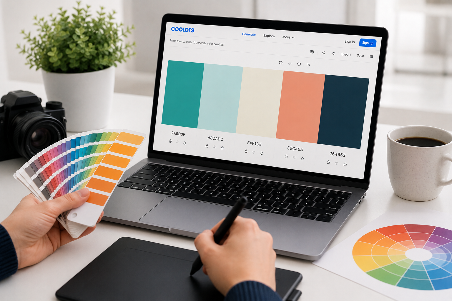
Coolors.co: The Speed Generator
Coolors is the fastest way from “I need colors” to “I have a palette.” Hit the spacebar, get five harmonious colors. Lock the ones you like, shuffle the rest. Export to CSS, SVG, PDF, or Adobe formats.
Best feature: The image upload. Drop any photo — a landscape, a product shot, a screenshot you admire — and Coolors extracts a palette automatically. This is how you reverse-engineer the color logic behind content you already love.
Limitation: Coolors generates harmonious palettes, not necessarily meaningful ones. A palette can be technically perfect but emotionally wrong for your brand. You still need judgment.
Use when: You need a palette in under 2 minutes, you’re starting from visual inspiration, or you want to explore options rapidly.
Adobe Color: The Theory Engine
Adobe Color (formerly Kuler) is built on classical color theory. It generates palettes based on specific harmony rules: complementary, triadic, analogous, split-complementary, and more. You can start from a color wheel, extract from an image, or browse trending palettes from the creative community.
Best feature: The accessibility tools. Adobe Color checks contrast ratios against WCAG standards in real time. This isn’t just nice-to-have — it’s legally necessary for some websites and professionally necessary for all of them.
Limitation: The interface assumes you understand color theory terms. Beginners can use it, but the learning curve is steeper than Coolors.
Use when: You need theoretically sound palettes, accessibility compliance matters, or you’re building a long-term brand identity.
Insider Note: The “trending” section in Adobe Color is underrated for competitive research. Search your industry, see what palettes successful brands use, then differentiate intentionally rather than accidentally.
Color Hunt: The Curated Gallery
Color Hunt is a community-driven collection of pre-made palettes. No generation, no theory — just thousands of palettes created by designers, rated by users, and tagged by mood. Browse “minimal,” “vibrant,” “pastel,” or “dark” and find palettes that have already passed the taste test.
Best feature: Curation by actual designers. These aren’t algorithm-generated combinations — they’re human choices with context. Each palette shows its creator and usage examples.
Limitation: You’re choosing from existing options, not creating something unique. For established brands, this risks looking derivative.
Use when: You want proven palettes without generation time, you need inspiration before committing to a direction, or you’re creating one-off content rather than a brand system.
The Before-and-After: Real Transformations
Theory is abstract. Here are three real scenarios where palette tools changed outcomes:
Scenario 1: The Instagram Feed
Before: A fitness coach’s feed used random colors — neon green on Monday, pastel pink on Wednesday, black and white on Friday. Followers couldn’t identify her content in a scroll. Engagement hovered at 2%.
After: She used Coolors to extract a palette from her gym’s interior design — charcoal, burnt orange, and cream. Every post used these three colors. Within six weeks, followers reported recognizing her content before reading the username. Engagement rose to 5.8%.
Tool used: Coolors image extraction + manual locking of dominant colors
Scenario 2: The Consulting Proposal
Before: A consultant’s proposals used default PowerPoint blue with red accents (unintentionally evoking bank logos and warning signs). Prospects commented on the “corporate” feel but rarely on the content.
After: She built a palette in Adobe Color using an analogous harmony based on sage green. The proposals felt calm, trustworthy, and distinctive. Her close rate improved, and two prospects specifically mentioned the “professional but approachable” design.
Tool used: Adobe Color analogous harmony + WCAG contrast verification
Scenario 3: The E-commerce Store
Before: A handmade jewelry store used bright, competing colors for every product category. The site felt chaotic. Cart abandonment was 78%.
After: The owner found a muted, earthy palette on Color Hunt tagged “minimal.” She applied it consistently across the site, using coral only for “Add to Cart” buttons. Cart abandonment dropped to 61%. The palette didn’t change the products — it changed how trustworthy the store felt.
Tool used: Color Hunt curation + intentional accent placement
Implementation: From Palette to Practice
Having a palette is step one. Using it consistently is where most people fail. Here’s the implementation system:
Step 1: Lock your codes
Write down your exact hex codes. Not “blue” — #1a365d. Not “gray” — #f7fafc. Specificity prevents drift. Store these in a note you can access instantly.
Step 2: Create templates
In Canva, Figma, PowerPoint, or whatever tool you use, set your palette as the default. Every new document starts with your colors pre-loaded. This removes the decision point entirely.
Step 3: Audit monthly
Review your last 10 pieces of content. Are your colors consistent? Did any new colors creep in? Did the accent color stay at 5% or expand to 15%? Small drift compounds fast.
Step 4: Evolve intentionally
Brands change. Palettes should too. But change should be deliberate, not accidental. If you update your palette, update everything simultaneously. A half-transition looks like a mistake.
Pro Tip: Create a “palette cheat sheet” image — a simple graphic showing your five colors with their hex codes and usage rules. Keep it as your phone wallpaper or desktop background for the first month. You’ll internalize it faster than any documentation.
Accessibility: The Non-Negotiable Check
Color choices aren’t just aesthetic — they’re functional. Approximately 1 in 12 men and 1 in 200 women have some form of color vision deficiency. Your beautiful palette is useless if 8% of your audience can’t read it.
Every palette you build should pass two checks:
Contrast ratio: Text must have a contrast ratio of at least 4.5:1 against its background (3:1 for large text). Adobe Color checks this automatically. So does WebAIM’s contrast checker. Don’t guess — test.
Color independence: Never rely on color alone to convey information. Red for “error” and green for “success” fails for colorblind users. Add icons, text labels, or patterns.
These aren’t constraints. They’re filters that improve your palette by forcing intentionality.
When to Hire a Color Professional
Palette tools handle 90% of color needs. But there are moments when human expertise matters:
- You’re building a brand that needs to last 10+ years and scale across physical products, digital platforms, and international markets
- Your audience has specific cultural color associations that automated tools miss
- You need custom color psychology research for high-stakes campaigns
- You’re differentiating in a saturated market where color is your primary competitive tool
For everything else — social media, presentations, small business websites, content creation — the tools above are sufficient. The professional’s real value isn’t color picking; it’s color strategy. Most creators don’t need strategy. They need consistency.
Related Articles
- How to Look Like a Pro Designer—Even If You’ve Never Opened Photoshop
- Creative Block? These Digital Tools Break It in Under 10 Minutes
- Ditch PowerPoint: Presentation Tools That Actually Impress Audiences
- How to Turn Your Smartphone Into a Professional Video Camera
- Professional Graphics in Minutes: The Secret Web Tools Designers Don’t Share
Sources and References
- Nielsen Norman Group. (2024). Visual Consistency and Brand Trust: The 50-Millisecond Judgment. NN/g Research. https://www.nngroup.com/articles/visual-consistency/
- Coolors.co. (2026). Color Extraction and Palette Generation Methodology. Coolors Documentation. https://coolors.co
- Adobe. (2026). Adobe Color: Color Theory and Accessibility Compliance. Adobe Help Center. https://color.adobe.com
- Color Hunt. (2026). Community Curation and Design Trends in Color Palettes. Color Hunt Blog. https://colorhunt.co
- WebAIM. (2026). Contrast Checker: WCAG 2.1 Compliance Standards. WebAIM Accessibility Resources. https://webaim.org/resources/contrastchecker/
About the Author: The InsightTrail team has generated more color palettes than we care to count. We’ve learned that the best palette isn’t the most beautiful one — it’s the one you actually use consistently.

Sunita Voss wanders through software like a city flâneur—observing, testing, occasionally getting lost, always finding shortcuts. She writes about digital minimalism, hidden web tools, and tech hacks with the patience of someone who enjoys the journey and the urgency of someone who values her time. No gurus. No gatekeeping. Just discovered paths.