Designing a Smartphone Home Screen That Reduces Distractions
Most people unlock their phone without giving much thought to what appears next. A familiar collection of icons, folders, widgets, and notifications fills the screen, and within seconds they tap the app they were looking for—or at least the one they intended to open. What often goes unnoticed is how frequently those intentions change. A quick glance at a message becomes ten minutes of scrolling, or checking the weather unexpectedly leads to social media, shopping, or news updates. The home screen is only visible for a brief moment, yet it quietly influences thousands of small decisions over the life of a smartphone.
Unlike a desktop computer, a smartphone is carried everywhere. It is used for work, communication, entertainment, navigation, photography, banking, shopping, and dozens of other activities. Because these roles overlap throughout the day, how the home screen presents information matters more than many people realize. Every icon competes for attention, every notification invites interaction, and every swipe creates another opportunity to become distracted.
Designing a more focused home screen is not about making the phone look minimalist or removing every enjoyable application. It is about reducing unnecessary decisions, making frequently used tools easier to reach, and creating a layout that supports your priorities instead of constantly redirecting your attention.
Your Home Screen Is a Decision-Making Interface
People often consider the home screen to be a place to store applications. In practice, it functions more like a control panel that guides behavior.
Every time the phone is unlocked, the brain processes colors, shapes, notification badges, and familiar icon positions before it makes any conscious decision. Applications that are easier to see or reach naturally receive more attention than those hidden several screens away. This happens so quickly that most users never notice the influence.
Interface designers understand this principle well. Interface designers usually place frequently used controls where users can reach them comfortably and recognize them immediately. The same idea applies to a personal smartphone. If the first screen contains mostly tools that support work, communication, navigation, or learning, those activities become easier to begin. If entertainment and endless content feeds dominate the screen, those options become the path of least resistance.
This does not mean entertainment apps are inherently bad. It simply means placement affects habits. A useful diagram comparing a cluttered home screen with an intentionally organized layout would help illustrate this relationship.
Convenience Should Match Importance
One of the most common home screen mistakes is organizing applications by installation date rather than usefulness. As new software is downloaded, icons gradually fill available space until every screen becomes a mixture of unrelated tools.
A more practical approach is to think about how often each application genuinely supports your daily routine. Communication tools, calendars, maps, note-taking apps, authentication software, and cameras often deserve quick access because they solve immediate problems. Applications used only occasionally can share space.
This does not require deleting anything. Modern smartphones provide app libraries, searchable launchers, and alphabetical lists that make infrequently used software easy to find without occupying valuable space on the main screen.
Many people worry that hiding rarely used apps will make them harder to access. In reality, searching by name often takes less time than visually scanning several crowded screens filled with similar-looking icons.
Visual Simplicity Makes Choices Easier
The human brain is remarkably efficient at recognizing patterns, but that efficiency decreases when too many visual elements compete for attention simultaneously.
Large numbers of colorful icons, animated widgets, and notification badges create constant visual activity, even when the phone is not in use. Individually, these elements seem harmless, but together they increase the amount of information that the device processes every time you unlock it.
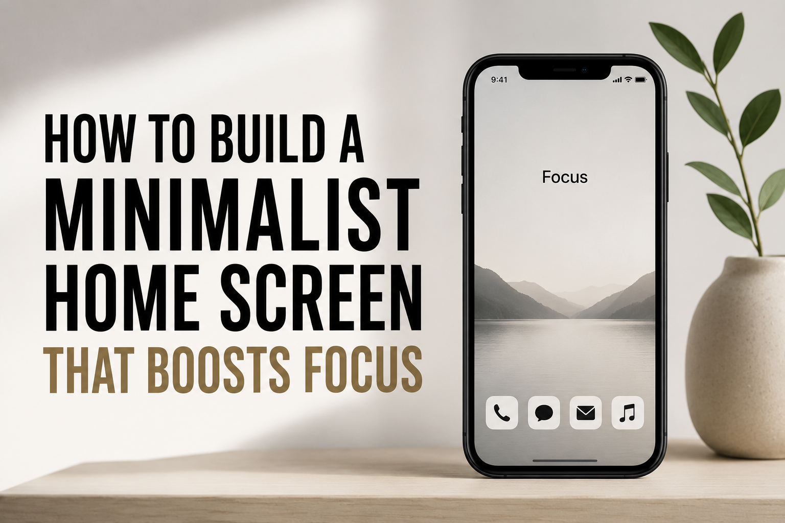
Reducing visual clutter does not necessarily mean using fewer applications. Instead, it means presenting information more intentionally. Leaving space between icons, limiting unnecessary widgets, and avoiding several pages of similar-looking folders can make navigation feel noticeably calmer.
Some users also prefer neutral wallpapers rather than highly detailed images. A busy background can reduce icon visibility and make the interface feel more crowded than it really is. The wallpaper should support readability instead of competing with it.
Notifications Do Not Need to Live on the Home Screen
Notification badges have become one of the strongest visual triggers on modern smartphones. A small number displayed beside an application icon communicates unfinished activity, encouraging users to open the app simply to remove the indicator.
The challenge is that not every notification represents something important. Promotional offers, social reactions, suggested content, and automated reminders often appear alongside genuinely useful messages, making it difficult to distinguish between them.
Many operating systems allow notification badges to be disabled independently of notifications themselves. This means important alerts can still appear on the lock screen or notification center without permanently displaying unread counters across the home screen.
For people who frequently unlock their phones only to clear notification badges, this small adjustment can noticeably reduce unnecessary interactions without affecting essential communication.
Widgets Should Present Information, Not Create More Decisions
Widgets have evolved significantly recently. Weather forecasts, calendars, reminders, battery status, smart home controls, and fitness summaries can now appear directly on the home screen without requiring the corresponding application to be opened.
Used thoughtfully, widgets reduce friction by displaying information that would otherwise require several taps. Checking the next appointment or confirming today’s weather forecast becomes almost effortless.
Problems arise when widgets become interactive dashboards competing for attention. News headlines, constantly updating market information, social feeds, and promotional recommendations encourage repeated checking even when no meaningful action is required.
A useful guideline is to ask whether a widget answers a question or creates one. A calendar widget answers, “What do I need to do next?” A constantly refreshing news widget often encourages another decision: “Should I open this article?” The first generally supports focus, while the second may interrupt it.
App Placement Should Reflect How Phones Are Used
Large smartphone displays have changed the way people interact with their devices. Reaching icons near the top of the screen can be less comfortable during one-handed use, particularly on larger models.
Many operating systems have introduced gestures and accessibility features to address this challenge, but thoughtful icon placement remains valuable. Frequently used applications positioned within comfortable thumb reach often make everyday interactions quicker and more natural.
This principle is especially helpful for apps opened dozens of times each day, such as messaging platforms, email clients, phone applications, cameras, and navigation tools. Less frequently used software can occupy higher rows or secondary screens without reducing usability.
The exact layout varies between individuals because hand size, device dimensions, and usage habits differ considerably. The important point is that the arrangement should support natural movement rather than requiring unnecessary stretching or repeated repositioning of the phone.
Folders Can Simplify Navigation—or Hide Everything
Folders are often recommended as a solution for home screen clutter. They certainly reduce the number of visible icons, but their effectiveness depends entirely on how they are organized.
Creating folders named “Apps” or “Utilities” that contain dozens of unrelated programs rarely saves time. Instead of searching across multiple home screens, users simply search inside oversized folders.
Smaller, purpose-based folders usually work better. Grouping applications around activities—such as travel, photography, finance, or document management—creates meaningful categories that are easier to remember later.
Some users also keep only one or two carefully organized folders on the primary home screen while moving everything else into the app library. This keeps important tools visible without forcing every application into immediate view.
The objective is not to hide software but to reduce the amount of visual searching required before finding the right tool.
Android and iPhone Offer Different Levels of Flexibility
Although the overall goal of reducing distractions is similar across platforms, Android and iPhone approach home screen customization differently.
Android generally offers broader control over launchers, icon arrangements, widgets, grids, gestures, and automation. Users who enjoy customizing every aspect of the interface often appreciate this flexibility because they can design layouts that closely match their workflows.
iPhone emphasizes consistency while still providing meaningful customization options through widgets, Focus modes, app libraries, and lock screen personalization. The available choices are more structured, which many users find easier to maintain over time.
| Design Element | Android | iPhone |
|---|---|---|
| Home Screen Layout | Highly customizable with launchers and grid options | Customizable within Apple’s interface guidelines |
| Widgets | Extensive sizing and placement flexibility | Integrated widget system with consistent layouts |
| App Library | Available (varies by manufacturer) | The built-in App Library organizes unused apps automatically |
| Focus Features | Available through Android settings (varies by device) | Built-in Focus modes with deep integration |
Neither platform is inherently better for building a distraction-free workspace. Success depends much more on thoughtful organization than on the operating system itself.
The Lock Screen Shapes Habits Before the Home Screen Appears
Many discussions about smartphone organization begin with the home screen, but the first thing most people see is the lock screen. If it is filled with message previews, promotional alerts, breaking news, shopping notifications, and reminders from dozens of applications, attention is already being divided before the phone is even unlocked.
A more intentional lock screen focuses on information that genuinely deserves immediate awareness. Calendar reminders, navigation updates, security alerts, authentication requests, or messages from important contacts may justify appearing there. Less urgent notifications can remain available in the notification center without demanding attention every time the display wakes.
Modern versions of Android and iPhone also allow different notification behaviors depending on the time of day or current activity. During work hours, a simplified lock screen may help reduce interruptions, while evenings can prioritize personal communication instead. Designing the lock screen with the same care as the home screen creates a calmer transition into every phone interaction.
Focus Modes Can Change the Phone Without Rearranging Everything
Many people assume the only way to reduce distractions is to redesign the entire home screen. In reality, modern smartphones provide another option through Focus modes and similar features.
Instead of maintaining one layout for every situation, Focus modes allow the phone to behave differently depending on what you are doing. During work, only business applications, calendars, document tools, and communication platforms may remain visible. Later, a personal profile can display entertainment, fitness, travel, or photography applications without requiring manual reorganization.
This approach recognizes that priorities change throughout the day. A phone used for business meetings in the morning may become a family communication device in the evening. Creating separate environments for different activities often reduces clutter because each one contains only what is relevant at that moment.
People who regularly switch between professional and personal responsibilities often find this approach easier than constantly moving applications between home screens.
Accessibility Features Often Improve Focus for Everyone
Accessibility settings are usually associated with users who have specific visual, hearing, or motor needs. While they remain essential for accessibility, many of these features also help create a less distracting smartphone experience.
Larger text sizes can reduce eye strain during long reading sessions. Higher contrast themes improve icon visibility. Reduced motion settings minimize unnecessary animations, making the interface feel calmer and more direct. Voice assistants and speech-to-text features can reduce repetitive typing when quick responses are needed.
These adjustments are not limited to one group of users. Someone working outdoors in bright sunlight may benefit from stronger contrast, while another person might prefer larger interface elements simply because they are easier to read quickly.
The broader lesson is that a focused home screen is not only about icon placement. Readability, comfort, and ease of interaction also influence how efficiently the device can be used.
Home Screen Organization Should Evolve With Your Routine
A layout that worked well six months ago may no longer reflect your current priorities. New responsibilities, changing work schedules, travel, education, or personal interests naturally alter which applications deserve quick access.
Rather than treating the home screen as something to organize once and forget, it is useful to review it occasionally. Ask simple questions: Which apps do I open every day? Which icons have not been touched for weeks? Are there tools I repeatedly search for because they are difficult to reach?
These reviews rarely require major redesigns. Small adjustments—moving one frequently used application closer to your thumb, removing an outdated widget, or relocating an unused app—often provide more lasting improvements than rebuilding the entire interface.
Because smartphone habits change gradually, periodic reviews help ensure the home screen continues supporting current needs instead of preserving old routines.
Personalization Should Never Come at the Expense of Usability
Smartphones encourage personalization through themes, icon packs, wallpapers, animated effects, and custom launchers. These options allow users to create a device that reflects their preferences, but appearance should not interfere with everyday usability.
For example, decorative icon packs sometimes make applications more difficult to recognize because familiar colors and shapes have been replaced. Highly detailed wallpapers can reduce text readability, while excessive animation may make navigation feel slower rather than smoother.
Personalization works best when it supports recognition instead of replacing it. Attractive design and practical usability are not competing goals, but when forced to choose between them, clarity should usually take priority.
A home screen is used hundreds of times each day. Small usability improvements often provide greater long-term value than purely visual changes that become less interesting after a few weeks.
A Few Common Habits Quietly Increase Digital Distraction
Many distractions do not come from the operating system at all. They develop through everyday habits that gradually reshape the home screen into something less efficient.
One example is allowing every newly installed application to appear on the first available page. Over time, frequently used tools become buried among software opened only once or twice each month. Another common habit is ignoring notification settings entirely, allowing every application to compete equally for attention regardless of its importance.
People also tend to create folders simply because there are too many icons rather than because the categories make sense. When folders become large collections of unrelated apps, they add another layer of searching instead of reducing it.
Recognizing these patterns is often more valuable than memorizing a specific layout. A home screen remains useful when it reflects deliberate choices instead of accumulated habits.
The Best Layout Is the One That Disappears Into the Background
There is no universally perfect home screen. Someone managing client projects throughout the day has different priorities from a student, a delivery driver, a healthcare worker, or a photographer. Their devices should naturally reflect those differences.
The most effective layouts share one characteristic, however: they require very little thought to use. Frequently needed applications are easy to reach, information appears when required, and unnecessary distractions remain out of sight until intentionally requested.
When this happens, the interface becomes almost invisible. Instead of thinking about where something is located, users focus on completing the task itself. That quiet efficiency is often a better measure of good design than the appearance of the home screen.
| Home Screen Habit | Likely Result |
|---|---|
| Keeping only frequently used apps on the first screen | Faster access with fewer visual distractions |
| Limiting notification badges | Fewer unnecessary app openings |
| Using widgets only for useful information | Important details remain visible without extra taps |
| Grouping apps by purpose instead of installation date | Easier navigation and better organization |
| Reviewing the layout every few months | Keeps the interface aligned with current routines |
Conclusion
A smartphone home screen does far more than display application icons. It shapes countless small decisions by influencing what captures attention first, what feels easiest to access, and what encourages repeated interaction. Because these moments occur many times every day, even small improvements in layout can have a meaningful effect over time.
Designing a distraction-aware home screen does not require deleting favorite apps or creating an overly minimalist interface. Instead, it involves making thoughtful choices about placement, notifications, widgets, folders, and visual organization so that the phone supports your priorities rather than constantly competing with them.
The most successful layouts are rarely the most elaborate. They are the ones that make everyday tasks feel natural, reduce unnecessary decisions, and allow the device to become a practical tool instead of a continuous source of interruption.

Sunita Voss wanders through software like a city flâneur—observing, testing, occasionally getting lost, always finding shortcuts. She writes about digital minimalism, hidden web tools, and tech hacks with the patience of someone who enjoys the journey and the urgency of someone who values her time. No gurus. No gatekeeping. Just discovered paths.